
This page summarizes the accessibility issues demonstrated on the Accessible University (AU) home page. An inaccessible before fixes page and accessible after fixes page are provided to contrast the differences between the sites with explanations.
Below you will find some "How-to do a web accessibility assessment" videos based on the example sites. You can also view a playlist of all the videos on YouTube.
-
Missing bypass block (skip-to main content)
A bypass block, otherwise known as a skip-to link, is a mechanism that is available to bypass blocks of content that are repeated on multiple Web pages. In this case, it allows keyboard-only users to skip over the navigation to get to the main content without needing to tab over the entire menu every time they load the page.
How to test for Bypass Blocks in Chrome:
-
Improper use of headings
Headings and subheadings help organize documents, including web pages, so that they are easy to read and understand.
Visually, the bad example page appears to include several headings. However, these headings are not marked up explicitly as headings using HTML heading tags (e.g., <h5>, <h2>). Instead, they are simply marked up as plain text that is bold and large. If HTML heading tags are used, screen reader users have access to this structural information. This helps them to gain a better understanding of how the document is organized. It also helps with navigation: Screen reader users can jump between headings in a document using a single keystroke, which is much more efficient than reading the entire page from beginning to end.
How to test for proper use of headings:
-
No alternate text on informative images
There are several images on the page. Some are decorative, but the logo, the three photos featured in the carousel, and others communicate important information. Whenever an image communicates information, it requires alternate text so users who are unable to see the image have access to its content.
How to test for alternative text on images:
-
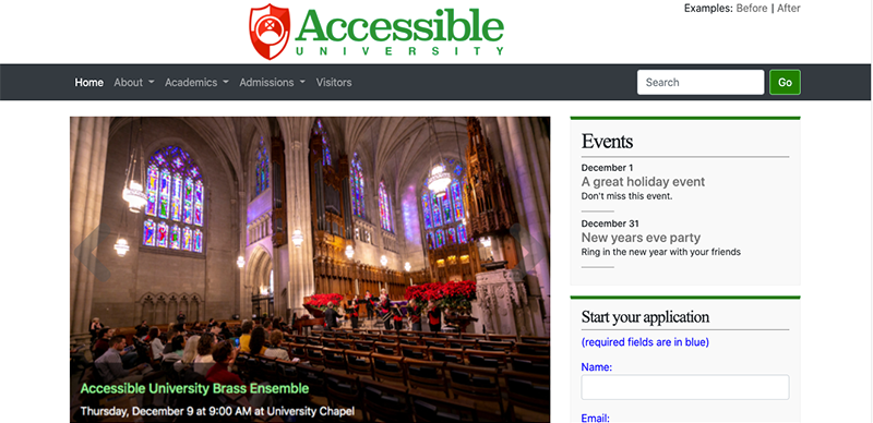
Images of text
Notice the text is embedded in the hero image. Screen readers cannot read text in images. They can only read real selectable text. If a person who was blind was on this site they could not know about the event because the title, date, and location of the event is in the image. If it is unavoidable the alternate text needs to have the same information so users who are unable to see the image have access to its content.
How to check for images embedded in text:
-
Missing or excessive alternate text on decorative images
Screen reader users do not need access to images whose purpose is solely decorative. The example on this page is the horizontal line that appears multiple times on the page. The current alt attribute for this image is "horizontal line graphic", which is unnecessary information, and can be especially cumbersome to listen to when it's repeated multiple times on a page. One solution is to present all decorative images as background images in Cascading Style Sheets (CSS). Another is to provide an empty alt attribute (alt="") for all decorative images. This is standard markup that instructs screen readers to ignore the image.
-
Insufficient color contrast
The navigation menu is difficult to see due to the choice of foreground and background colors. The W3C Web Content Accessibility Guidelines (WCAG) 2.0 includes specific contrast ratios that must be met in order to meet the guidelines at various levels. Contrast can be easily checked with free tools like the Colour Contrast Analyser and the WCAG Contrast Checker plugin for Firefox.
How to check for insufficient color contrast:
-
Insufficient visual cues
This page includes visual cues that show mouse users when they're pointing to clickable items on the page such as links. However, this same functionality is not provided for keyboard users, and they would arguably benefit from it even more than mouse users. Without a clear visual indication of one's current location on the page, keyboard users can have a very difficult time getting their bearings as they tab through links and controls. Visual cues for mouse users are typically provided in CSS using the selector :hover. The same visual cues can be replicated for keyboard users by using the selector :focus. Here's an example in CSS:
a:hover, a:focus {
color: white;
background-color: black;
}How to check for hover states:
How to check for focus states:
-
Inaccessible dropdown menu
The navigation menu on this page includes sub-menus that appear when users hover over the menus with a mouse. However, these same menus do not appear for non-mousers. If a user navigates to the menu by pressing tab, the sub-menus do not appear; nor do the main menu items send the user to a new page. They simply don't work. If they did work, screen reader users would depend on supplemental markup added to the HTML that informs them that an item has a submenu, and whether that submenu is expanded or collapsed. This supplemental markup can be provided using Accessible Rich Internet Applications (ARIA). ARIA is a W3C specification first published in 2014 that is designed to communicate roles, states, and properties of user interface elements to assistive technologies. ARIA is essential for accessibility of today's modern web interfaces. The W3C has created a companion guide WAI-ARIA Authoring Practices, which includes a set of recommended design patterns for common widgets, including a menu design pattern. These standard design patterns include detailed recommendations for how users should be able to interact with the widget using the keyboard, as well as recommendations for which ARIA attributes should be used in order to make the widget accessible using assistive technologies. All dropdown menus should be coded in accordance with these recommendations so users can count on dropdown menus everywhere having a consistent interface.
Other menu systems can be found on the WC3 Fly-out Menu suggestions page.
How to test if a menu might be compliant:
-
Redundant, uninformative link text
This example includes three links that say "Click here". Screen reader users may encounter these links out of context. For example, many screen readers include functionality that enables users to quickly generate a list of links and navigate through that list. If links are presented out of context, such as in a list of links, they should be unique, and should be meaningful in-and-of-themselves.
How to test for redundant link text:
-
Color only used to communicate information
The links within the main content are distinguishable from other text by color alone. Look closely! They're difficult for most people to spot. Even if the color choice had been more dramatic, some users (for example, those who are color blind) would still be unable to distinguish link text from non-link text. This is why browsers underline links by default&it's a good, accessible practice.
Also, in the application form, required fields are marked with blue text. Again, even if a more obvious color were chosen, some users would still be unable to identify which fields are required. The solution is to communicate information using other means, in addition to color. For example, the labels for required fields could appear in bold and be marked with a * or if space permits, with "(required)". Also, if markup is available to communicate the same information, use that. For example, in the case of required fields, use the HTML5 required attribute, supplemented with aria-required="true" for assistive technologies that don't fully support HTML5 attributes.
How to check for color only issues:
-
Language not specified
This page includes content in both English and Spanish. Leading screen readers support both of these languages (and many others), and can switch on the fly between languages if they know to do so. If they don't know to do so, an English-speaking screen reader will read the Spanish section using English pronunciation rules, which produces poor if not indecipherable Spanish. The technique for addressing this issue is to provide a lang attribute on the <html> element, with the value being the official language code for the primary language used in the document. For example, an English document would include this html tag:
<html lang="en">If the web page includes content that differs from this primary language, the language of that section of content must also be identified in the code. For example, to markup a paragraph as being in Spanish, the paragraph tag would look like this:
<p lang="es"> -
Missing accessible form markup
In the application form, sighted users know which labels accompany the various form fields by their position. In the first six fields the label appears immediately above the form field, and in the set of possible majors the label appears immediately after each checkbox. Although these relationships may seem apparent to sighted users, they're not so obvious to screen reader users. HTML includes markup that enables form fields and their labels to be explicitly associated with one another. If this markup is not present, screen readers have to guess which labels are associated with each field, and they don't always guess correctly. For example, some screen readers incorrectly assume the label for each checkbox is the text that immediately proceeds it, rather than the text that follows it. Therefore, a screen reader user could check the Psychology checkbox, having been erroneously informed by their screen reader that they're checking the Physics checkbox. To explicitly associate labels with form fields, each label must be marked up with the HTML <label> element. The <label> element has a for attribute whose value matches the id attribute of the associated form field.
Also, when a form uses checkboxes, there are typically two pieces of critical information related to each checkbox: The label associated with that checkbox (e.g., Psychology) and the overall question or prompt (e.g., Desired major(s)). In order to explicitly communicate the relationships between all of this information, the entire set of checkboxes and labels, plus the overall question or prompt, should be wrapped in a <fieldset> element, and the question/prompt should be marked up as a <legend>. The individual checkbox labels should be marked up using the <label> element as described above. With this accessible markup in place, screen readers can announce the overall question or prompt as the user enters the fieldset, or as he or she selects one of the checkboxes. This same markup applies to radio buttons.
How to check for inaccessible form markup:
-
Inaccessible CAPTCHA
Online forms often include images of distorted characters called CAPTCHAs ("Completely Automated Public Turing test to tell Computers and Humans Apart"). CAPTCHAs are designed to prevent spammers and other unwanted users from filling out and submitting the form automatically. The usual method for making images accessible (alternate text) would not be feasible for CAPTCHAs since this same technique would make the images accessible to robots. The W3C published a Working Group Note in 2005 that explores the Inaccessibility of CAPTCHA and proposed possible solutions. Several solutions have been proposed and implemented with some success:
-
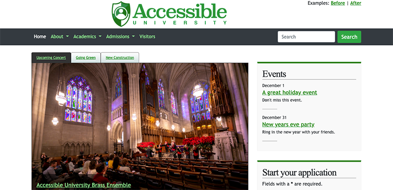
Some sites have implemented text CAPTCHAs that ask simple logic questions. An example of this approach is textCAPTCHA. This is a fully accessible solution, but as spammers' tools get smarter there may be limits to its effectiveness. The accessible version of the AU home page demonstrates this method (note that this is for demonstration purposes only; there is no actual server-side validation).
-
Google's reCAPTCHA version 3 seeks to provide a more user-friendly option for everyone, including assistive technology users. Their technology is evolving though, and its accessibility is a moving target. If considering using reCAPTCHA, be sure to investigate its current state of accessibility before deploying. Otherwise your CAPTCHA may block some users from completing an important task (like submitting an application form).
It is important to note that CAPTCHA barriers still exist for deaf-blind users. There can also be cultural barriers around language, culture, and diverse experiences.
Checking if CAPTCHA might be accessible:
-
-
Inaccessible form validation
On the bad example the user submits the form, it's validated using JavaScript before the data is submitted to the server. If the user's submission fails validation, an error message is displayed at the top of the form and the page is automatically scrolled up to ensure that sighted users are aware of the error.
This feature has many problems:
-
Although the error message is clearly visible to sighted users, screen reader users are not informed that this message has appeared. They might find the message eventually, but their focus is not automatically taken there. They will most likely become confused since clicking submit seems to have no effect, but they have no idea why.
-
The error message is unclear. It states that there are errors, but does not identify what those errors were. The burden of finding the errors is left to the user, which adversely impacts usability for everyone, but can be especially challenging for screen reader users.
JavaScript-based form validation can be a useful feature, but it should be designed in a way that considers the needs of all users, including those who can't see the error message visually, and those who are unable to use a mouse. A better design would be one in which:
-
the capabilities of HTML5 are fully utilized, including the required and pattern attributes, as well as <input> types such as type="email" and type="url". Using these features enables browsers to provide their own validation, which is likely to be supported by assistive technologies.
-
the error message includes enough detail so that all users know which fields have errors.
-
the error message is written to a container that is marked up with role="alert". This is ARIA markup that results in screen readers announcing the message to users as soon as it appears, regardless of their current location on the page.
-
the user's focus can be sent automatically to the first field on which a correction is needed
How to check for form validation problems:
-
-
Missing ARIA Landmark roles
ARIA includes eight Landmark roles, which are specific regions of the page identified according to their function. They are: application, banner, complementary (e.g., a sidebar), contentinfo (e.g., a footer), form, main, navigation, and search. By defining the Landmark role of a block of content (for example role="main" for the main content), screen reader users can quickly locate and jump to the section of the page that meets their needs. The accessible version of the AU Home Page uses ARIA Landmarks to mark the banner, main, navigation, form, and contentinfo sections of the page. The navigation menu additionally uses aria-label to clearly communicate the function of the navigation menu (in this case, aria-label="Main menu"). This supplemental label is announced by screen readers and is especially helpful for distinguishing between navigation regions if there are more than one of these regions on a page.
Some of the ARIA Landmarks map directly to HTML5 elements. For example, role="main" is the same as <main> and role="navigation" is the same as <nav>. However, it's ok to use both to ensure support for older assistive technologies, which supported ARIA before supporting HTML5.
How to check for Landmark roles:
-
Inaccessible modal/popup window
In the "Can You Spot the Barriers?" section of the AU home page, the link that opens the Cheatsheet of Accessibility Issues opens the content in a modal window, which appears in the foreground while background content is masked behind a dark transparency. This is not truly modal, however. If a keyboard user presses the Tab key they may discover that their focus remains in the background, and they may find that it's very difficult to tab to the dialog so they can dismiss it. Also, screen reader users are not aware that a dialog has appeared. Instead, they're likely to be confused because they clicked on a link but nothing seemed to happen.
How to check modals/popups for accessibility:
-
Inaccessible carousel
Carousels or slideshows are common features on university home pages. Unless designed and coded with accessibility in mind, these features present a variety of accessibility issues:
-
Keyboard users are unable to access all components
-
Screen reader users are unable to operate the controls or access and understand all content.
-
People who are distracted by movement or who need more time to read the content are unable to pause the animation.
How to check if a carousel is accessible:
-
-
Missing accessible table markup
Forcing two distinct data sets into one table
This is two different sets of data. It is best to split two data sets into two tables rather than forcing them into one. It makes it overly complicated for both sighted users and screen reader users.
A plus side of splitting the table into two tables is that we no longer need to use abbreviations of words like "Psy". The user might not know that "Phy" is for Physics. Using the strategy of using <abbr> element to decode the abbreviation would still leave a barrier for sighted users who are not familiar with the <abbr> behavior, keyboard-only users, touch screen users, and some screen reader users.
Missing accessible table markup
Data tables can be challenging for screen reader users to understand, particularly if they have many columns, or a complex layout with nested rows or columns, as is the case with the AU Enrollment Trends table. Imagine reading a table from left to right and top to bottom, with no visual access to the column headers. When you're halfway through the table, will you remember which column you're in? This is not unlike what screen reader users experience as they try to read a data table unless the table includes semantic markup that explicitly defines the relationships between the table's parts. For example, table headers should be marked up with the <th> element. Also, headers should include the scope attribute, which identifies whether the cell is a row header (<th scope="row">) or a column header (<th scope="col">).
If the table includes nested rows or columns, the relationships between headers and cells become even more difficult to decipher. In these sorts of tables, there are typically two, three, or more headers that apply to every cell in the table. To explicitly express these relationships using HTML markup, each header needs a unique id (e.g., <th scope="col" id="col1">), and each data cell needs a headers attribute which lists the id's of all headers that apply to that cell, separated by a space (e.g., <td headers="col1a col2a row1">). When a table includes all of this markup, screen reader users can easily ascertain their current position with a table, and their screen reader can announce all of the headers that apply to the current cell.
Also, it is helpful to provide a brief summary of a complex table specifically for screen reader users, as this will help them to understand how the table is organized before they explore it. Prior to HTML5, this was accomplished with the summary attribute on the <table> element. In HTML5, a summary can provided in a separate paragraph or div adjacent to the table, and that can be explicitly linked to the <table> element with the aria-describedby attribute. The summary might be useful for all users, but if it truly only benefits screen readers, then it can be visually hidden without hiding it from screen reader users. See the accessible version of the AU home page for an example.
Also, it is helpful to provide a caption for all tables using the <caption> element, nested within the <table> element. In the accessible version of the AU home page, the table caption "AU Enrollment Trends" is redundant since there is also a heading with this same information immediately prior to the table. However, the caption is still important because it's explicitly associated with the table. If screen reader users jump directly to the table (for example, using the "t" shortcut key in JAWS or NVDA, or the rotor in VoiceOver), their screen reader announces the caption so they can quickly tell which table they're on. As with the table summary, the caption can easily be hidden from sighted users using CSS if it's redundant or unnecessary for them to access this information.
-
HTML fails validation
The rules of markup languages like HTML were meant to be followed. If a web page uses non-standard tags or uses standard tags inappropriately, this increases the likelihood that some browsers or assistive technologies will render the page incorrectly. Therefore web pages should be checked with tools like the W3C Markup Validation Service. A check of the inaccessible version of the AU home page results in five errors, all of which are accessibility-related.